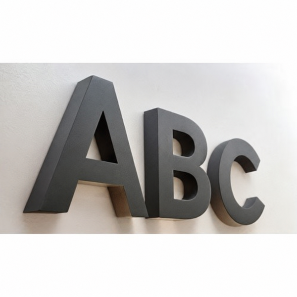
Create a bold lettering display with AdFusion Graphics non-lit acrylic letters. The featured charcoal-grey ABC design combines uppercase block shapes, broad faces and visible side depth. With no built-in illumination, the visual effect comes from the letterforms, background contrast and ambient lighting. The image illustrates the style rather than confirming the supplied character set.
The AdFusion Graphics non-lit acrylic letters bring a bold dimensional look to a lettering display without built-in illumination. The featured ABC design uses uppercase characters in a dark charcoal-grey appearance, with broad faces and visible side depth. Its simple styling places the emphasis on the letter shapes and their contrast against the background.
Non-Lit Acrylic Letters with a Bold ABC Design
The sample shows a straight-sided A, a B with two rounded openings and an open curved C. Their sans-serif outlines avoid decorative flourishes, creating a consistent block-letter appearance. The combination of straight strokes and curved sections gives each character a recognisable profile within the arrangement.
The angled view reveals the sides of the letters as well as their front faces. Darker inner edges and natural shadows help communicate the dimensional effect. Against the pale wall shown in the image, the charcoal colour creates a clear separation between the characters and their surroundings.
A Display without Built-In Lighting
These non-lit acrylic letters rely on ambient light rather than internal LEDs. Their visual presence comes from colour, shape and depth. This makes the design relevant to lettering concepts where a simple physical outline is the intended focal point.
For a reception composition, studio backdrop or initial-themed display, consider how the lettering relates to the surrounding wall and nearby graphics. The ABC arrangement illustrates the style; the character selection and quantity for your order should match the options specified in the listing.
Planning Spacing and Contrast
Allow enough space between characters to keep their outlines distinct. Check the arrangement from the main viewing position, since an angled view can make the gaps appear narrower. A plain background helps the open areas within the A and B remain visually clear.
Explore the AdFusion Graphics 3D Letters collection for related styles. Choose these non-lit acrylic letters for their understated charcoal appearance, bold uppercase shapes and dimensional character.
6. Key features
Non-illuminated acrylic lettering, as specified.
Uppercase ABC sample in a bold sans-serif style.
Dark charcoal-grey appearance.
Broad letter faces with visible dimensional depth.
Straight and curved letterforms with clearly defined openings
Reviews
There are no reviews yet.
Be the first to review “Non-Lit Acrylic Letters – Charcoal Grey ABC Design”Cancel Reply


Reviews
There are no reviews yet.