PAN INDIA DELIVERY | CUSTOMIZED PRODUCTS | SECURE PAYMENTS
Serif Letter N – Taupe Uppercase Dimensional Design
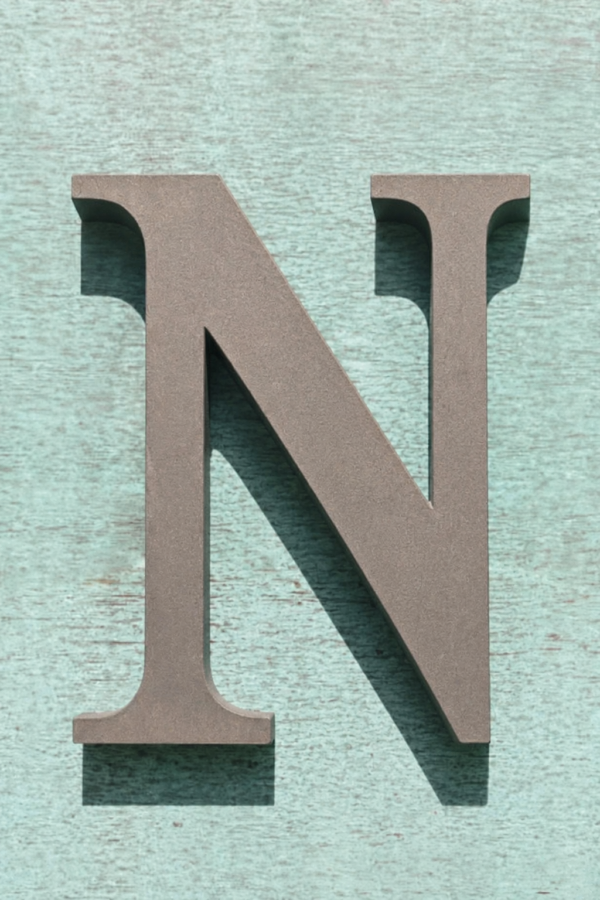
Bring a traditional typographic accent to your display with the AdFusion Graphics serif letter N. Its uppercase outline combines a broad diagonal stroke, narrower upright stems and projecting serifs. A muted taupe colour and finely textured appearance add visual detail, offering a restrained design direction for initial arrangements and classic lettering concepts.
The AdFusion Graphics serif letter N pairs an uppercase silhouette with a muted taupe appearance. A broad diagonal stroke connects two upright stems, while projecting serifs give the character a traditional typographic style. Fine mottling across the face adds visual interest to the otherwise restrained colour treatment.
Serif Letter N with Classic Letterform Details
The design uses a pronounced difference between its broad diagonal and narrower upright strokes. Curved transitions lead into the serifs, softening the points where the straight stems meet their horizontal ends. These details give the outline more variation than a simple block character.
Open spaces on either side of the diagonal preserve the recognisable N shape. The supplied image shows a nearly frontal view, with dark shadows falling beneath and beside the edges. This presentation gives the letter a raised appearance while keeping its front profile clearly visible.
Taupe Colour and Textured Appearance
The face has a subdued grey-brown tone with a finely textured look. This neutral palette can provide a quieter visual accent than brightly coloured lettering. In the reference setting, the taupe character contrasts with a pale mint background, allowing the serif edges and diagonal stroke to remain distinct.
This serif letter N offers a design direction for an initial-based arrangement or a classic lettering concept. A reading corner, reception composition or personal display could draw on its traditional character during planning. Consider how its narrow stems and wider diagonal relate to the other shapes in your proposed layout.
Planning the Surrounding Composition
Choose a background that keeps the outline visible without competing with the letter’s fine surface detail. A plain setting can emphasise the typography, while a textured backdrop creates a more layered visual relationship. Compare both options at the viewing distance intended for the display.
Leave clear space around the projecting serifs, especially near neighbouring objects or graphic elements.
Explore the AdFusion Graphics 3D Letters collection for related lettering styles. Choose this serif letter N for its distinctive stroke contrast, neutral taupe appearance and traditional uppercase outline.
6. Key features
- Uppercase N with a traditional serif outline.
- Broad diagonal stroke connecting narrower upright stems.
- Projecting serifs with curved transitions into the stems.
- Muted taupe, grey-brown appearance.
- Fine mottled surface detail and a raised visual profile

Reviews
There are no reviews yet.